My Most Used, and Dare I Say Favorite Paint Colors for Any Season
After many years of designing, I have come to realize that one of the hardest parts for our clients is knowing and selecting the right paint color. Luckily, for me, after many years of doing it, I feel like it’s one of the easiest, so I am always overjoyed to offer that support! Project after project I even started to realize that I have some “go to’s” and today that’s what I want to share with you (in case all this sitting around your home is making you want to change a wall like it is for me)!
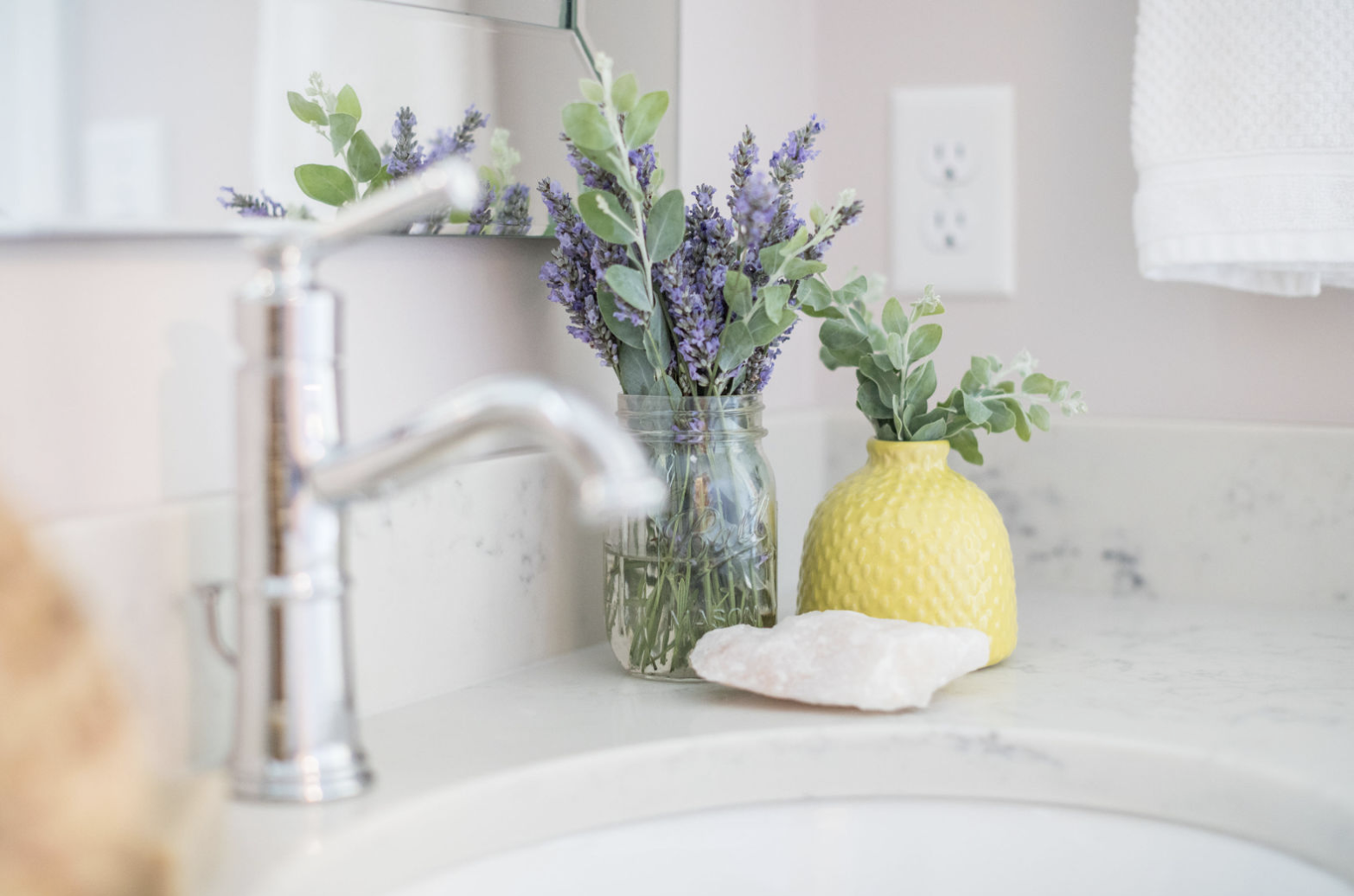
- My three favorite whites.
- White Dove - Benjamin Moore: A nice, soft, white with the smallest touch of gray which makes it my definition of the perfect trim and ceiling color. It is a very adaptable white (which shockingly enough isn’t always the case) that looks great in just about every room in the house!
- White Truffle - Sherwin Williams: Remember when we used to have those porcelain dolls back in the day? That perfect soft and beautiful white with the smallest touch of pink is just about all I can compare this one to. Any wall covered in this deserves to be on display just like one of those old dolls!
- Cloud White - Benjamin Moore: The most classic off-white of them all! This color is clean and bright without being overly stark. I often turn to this color when the lighting in a room isn’t working for a different white. That little bit of off-white is what helps this color stand on its own while still being plain white.
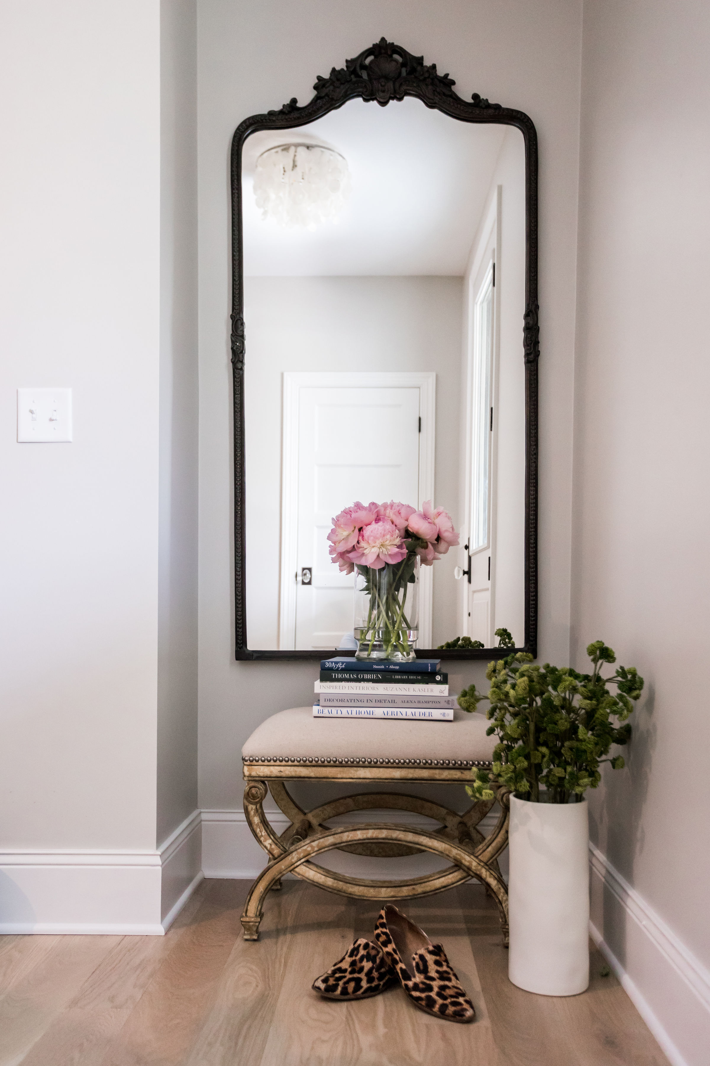
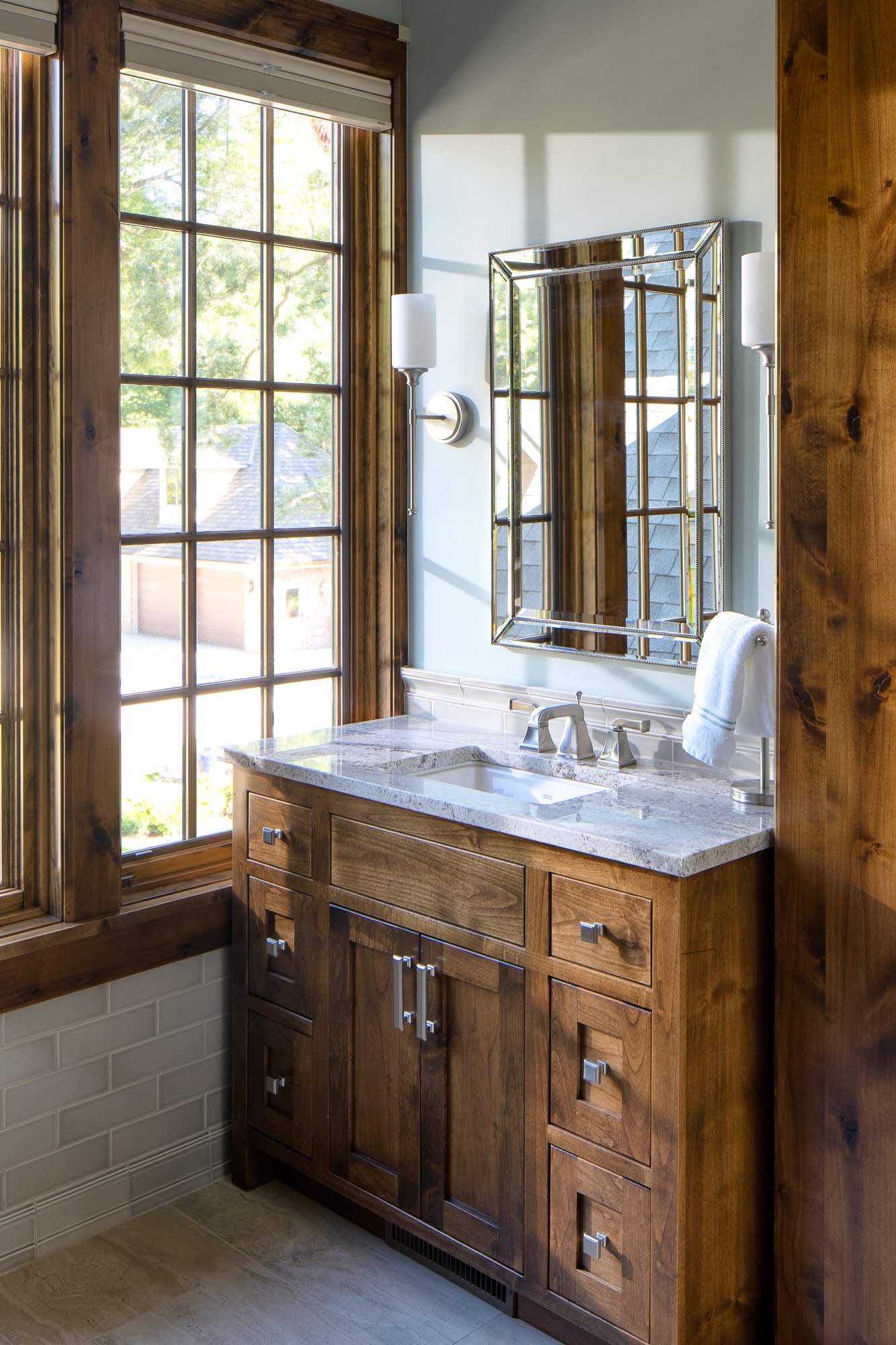
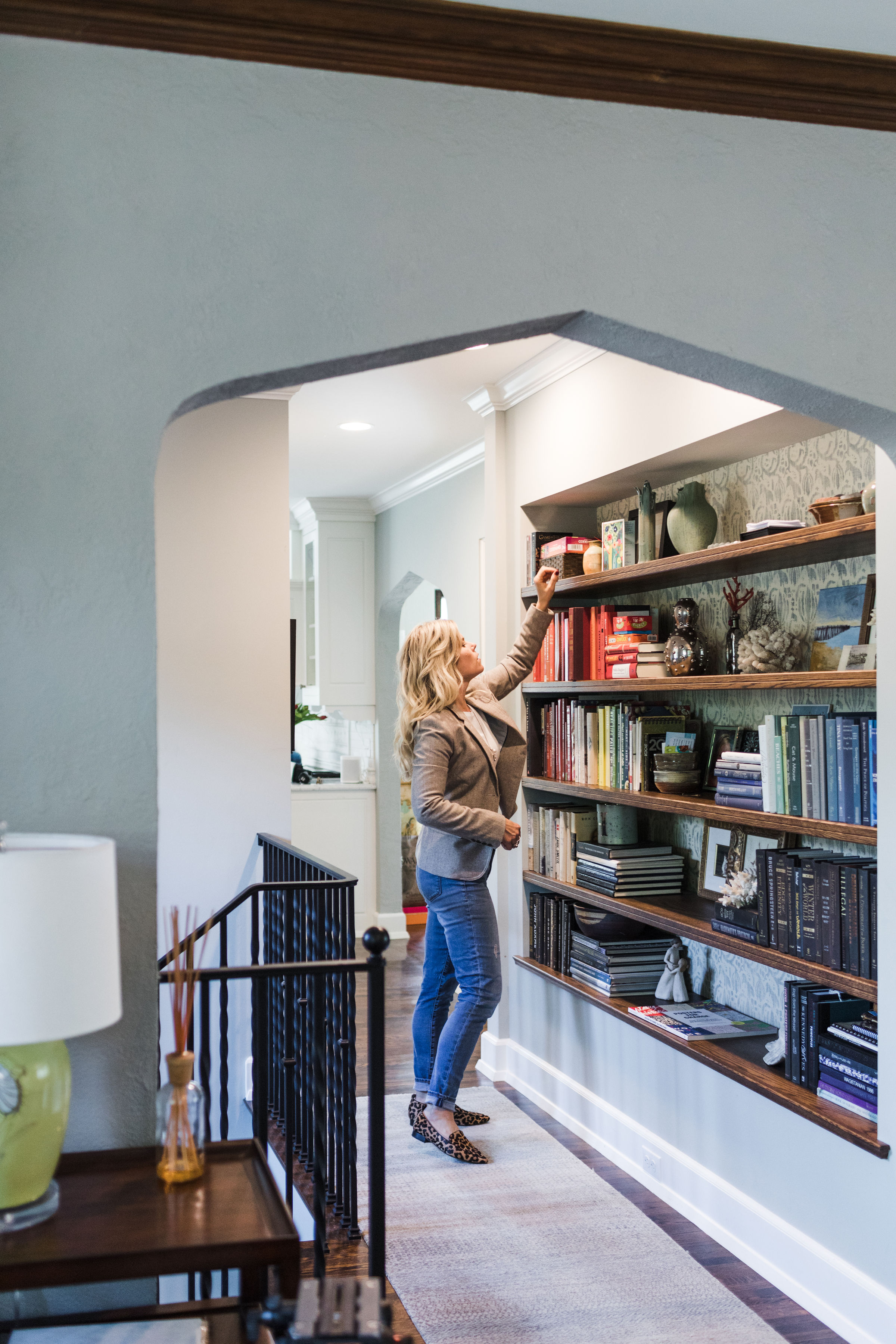
- My three favorite wall colors.
- Agreeable Gray - Sherwin Williams: A classic and warm gray that leans towards a beige. I know some of us panic when we say that but let’s be clear that there is a difference between a gray that leans towards a beige and a beige that leans towards a gray. Confusing right? That’s why we will suggest this one and see if you “agree”.
- Beach Glass - Benjamin Moore: The perfect combination of warm and cool. This color is known for its versatility in every lighting situation which is a big advantage. As designers whenever we are picking a paint color we have to test out how it reads in daylight, warm light, and cool light. From there we evaluate the space we are thinking of putting it so see if the color will read how we want it to.
- Flora - Benjamin Moore: We all have those colors that we just love the way they make us feel, right? Flora is one of those colors for me. It’s earthy and organic which just makes you feel welcome in a room. Pictured above is my ideal placement of this color. A spot along the way that just makes you want to stop and stare. I like this color a lot because it pairs well in both traditional and contemporary homes and we do our fair share of both around here!
- My three favorite bold colors.
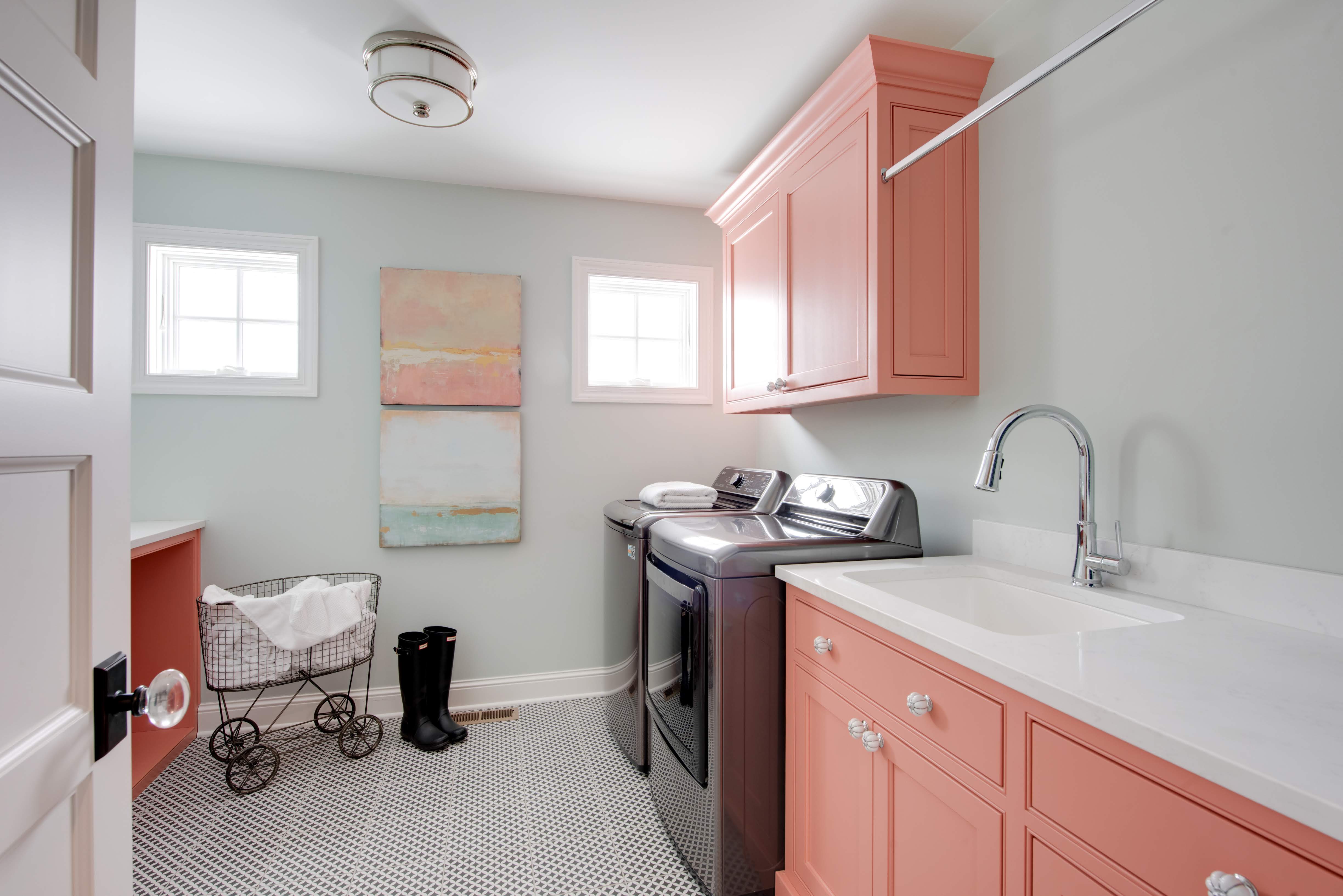
- Coral Reef - Benjamin Moore: If you haven’t already caught on, coral is a favorite around here. Recently, when getting to be my own client for the first time I decided to go bold and spice up the laundry room. Hey - we all need a little fire under our wings when it comes to laundry for a family of 6. This bright and peppy color never fails to make my day every time I pass by this room. If the paint in our homes isn’t making us feel something every time we pass it, we haven’t done our job right.
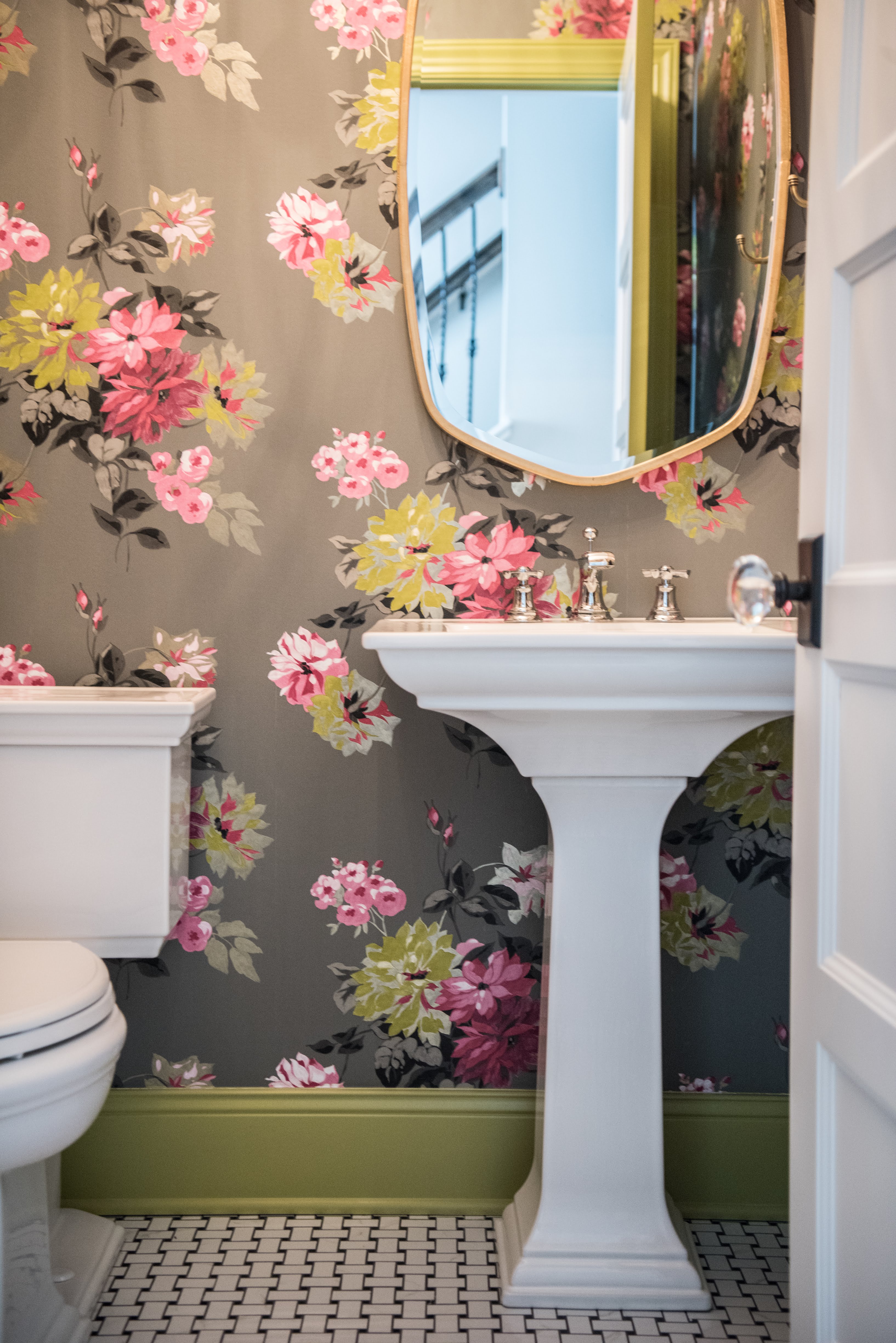
- Sassy Green - Sherwin Williams: Again with the spunk. This one says it for itself in its name. Yes, it's green, and YES it’s sassy! I love how this green strays from the norm on characteristics of your average green. I always feel like a powder room is just asking for personality so in an effort to embrace the bold in this one we needed to paint the trim to match the wallpaper.
- Pinelands - Benjamin Moore: Remember three seconds ago when I said: “norm characteristics of a green”? Yep - this one does have all of those characteristics. But still manages to be bold in a totally different way than Sassy Green. It is still in that classic, organic and earthy range of green but the deeper tone of this one really sets it apart. Put this on a front door, kitchen island, or in your living room as a focal point and you will be set. It’s fun, playful and bold but will carry the sophistication that you are looking for.
You are officially on the “in” with our favorite paint colors! Always remember we are here to be your sounding board. We’ve never been able to relate to the phrase “it’s like waiting for paint to dry”... because if it’s the right color we would be there in a heartbeat to “watch it dry”.
