3 Tips for Choosing Paint Colors (and One Major Pitfall to Avoid)
When it comes to interior design, one of the best (and most accessible) ways to transform your space is by choosing paint colors- the right way. Unfortunately, it’s not as easy as it sounds! Too often you could find yourself standing in front of a million little paint chip cards at your hardware store, overwhelmed by the options and grabbing whatever’s nearest. We’ve all been there, but the paint color you choose has the potential to drastically shift the feel and look of your room, so let’s not wing it! I’m here to give you the inside tips on how to have confidence next time you find yourself faced with the dizzying display of the color wheel.
1. Consider the Purpose and Time of Day
Before even considering a color palette, it’s essential to understand the purpose of the room. Paint color choice is a powerful tool for setting ambiance, and you want that tool to work towards your goals, not against them! Do you envision a calming bedroom retreat or an invigorating kitchen space? The feeling you want to evoke in the room—whether it’s calm, sultry, warm, energizing, or simple—will guide your wall color choices and set the tone for the entire design.

A little trick of the trade is also to consider the times of day you’re likely to use your space. The kitchen is most likely to be busting around dinner time and evenings spent entertaining. What does the natural lighting look like in the room during that time of day, and how can you capitalize on it?
For example, if you want your living room to be a cozy, comforting gathering place after work, but it doesn’t get a lot of natural light in the evening, you may consider choosing paint colors that warm up the space to aid in creating the environment you’re after.
2. Invest in Quality Paint
I know it’s tempting to save a little money when the paint color samples look virtually the same, but one piece of advice I consistently share with clients is to buy the best paint they can afford. It’s a 100% worth-it investment. Quality paints offer superior coverage, durability, and color retention, ensuring a more satisfactory and longer-lasting finish. The result is a space that not only looks stunning but withstands the test of time.
3. Take Your Time Choosing Paint Colors
We’ve all gotten excited and jump-started a project, but when it comes to choosing the perfect color scheme, you want a finished project you’ll love for years! This means it’s crucial to avoid rushing the decision-making process and up up with the wrong paint color. Test samples in the actual space, and live with them for a few days! This helps to make sure you can see it in all different lights, and that the undertones (not always obvious at first) complement rather than clash with what you already have going on in the room.

Avoid This Mistake When Choosing Paint Colors
Speaking of time, hopping on current trends just because the latest Pinterest board, home magazine, or Instagram reel says to may be the biggest mistake I see. A paint color should reflect your unique style and home, not whatever happens to be trending right now. When feeling the pressure to create an all-white kitchen, or go buy the latest shade of green, step back and take a breather. Give yourself enough time to consider if that trend will still serve your home a year from now. If not, it’s best left on the Gram!
Statement Pops of Color for Inspiration
As an interior designer, I’ve gotten to work with many clients to choose the perfect paint color for them. If you need some color inspiration, looking at other projects can help you envision what works best for your space.
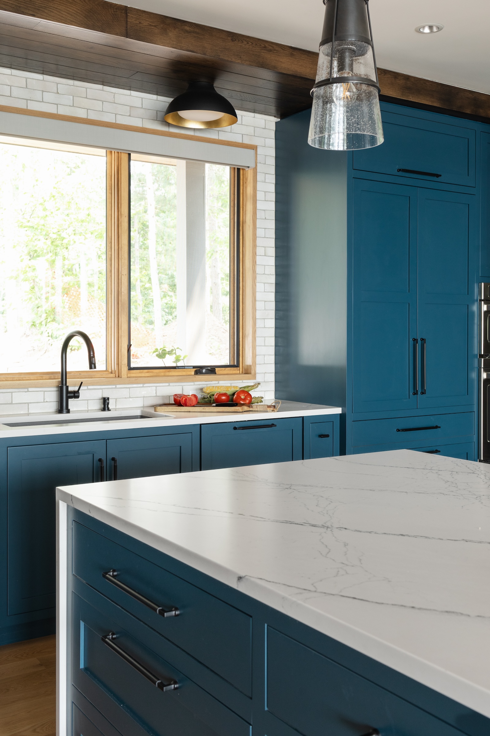
Some of my favorite paint colors on past projects include a stunning blue kitchen in the Sand Lake Project featuring Sherwin Williams #9660 Tarragon and #7029 Agreeable Gray. The East-Sink wall adds a captivating statement to the space!

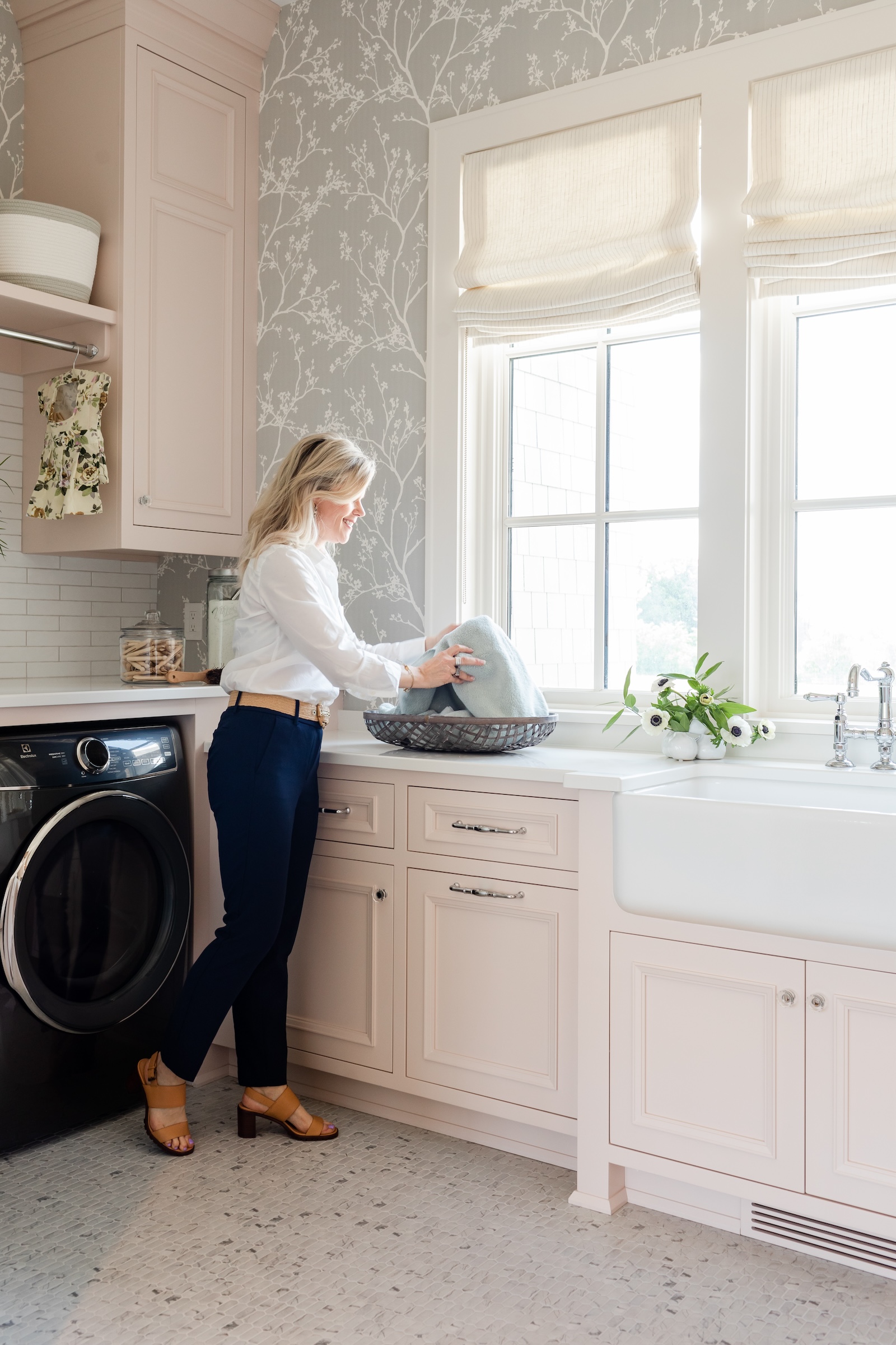
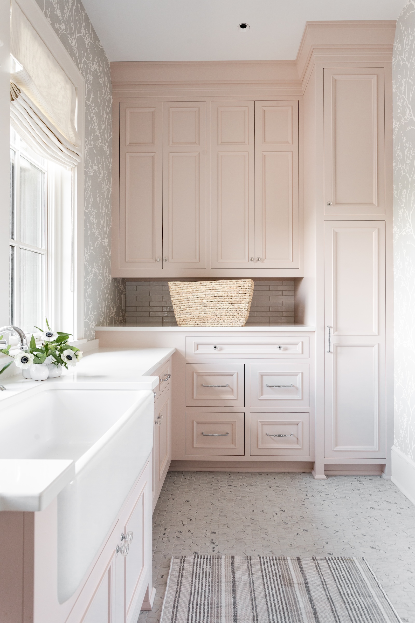
If you’re looking for statement paint color ideas, the blush laundry room in the Shingle Style Lodge Home and the McCool Drive kitchen are also noteworthy, the latter showcasing the chameleon-like quality of Benjamin Moore’s Silver Marlin. This color, with its shifts between blue-green and soft white, is a testament to the power of a well-chosen statement hue.

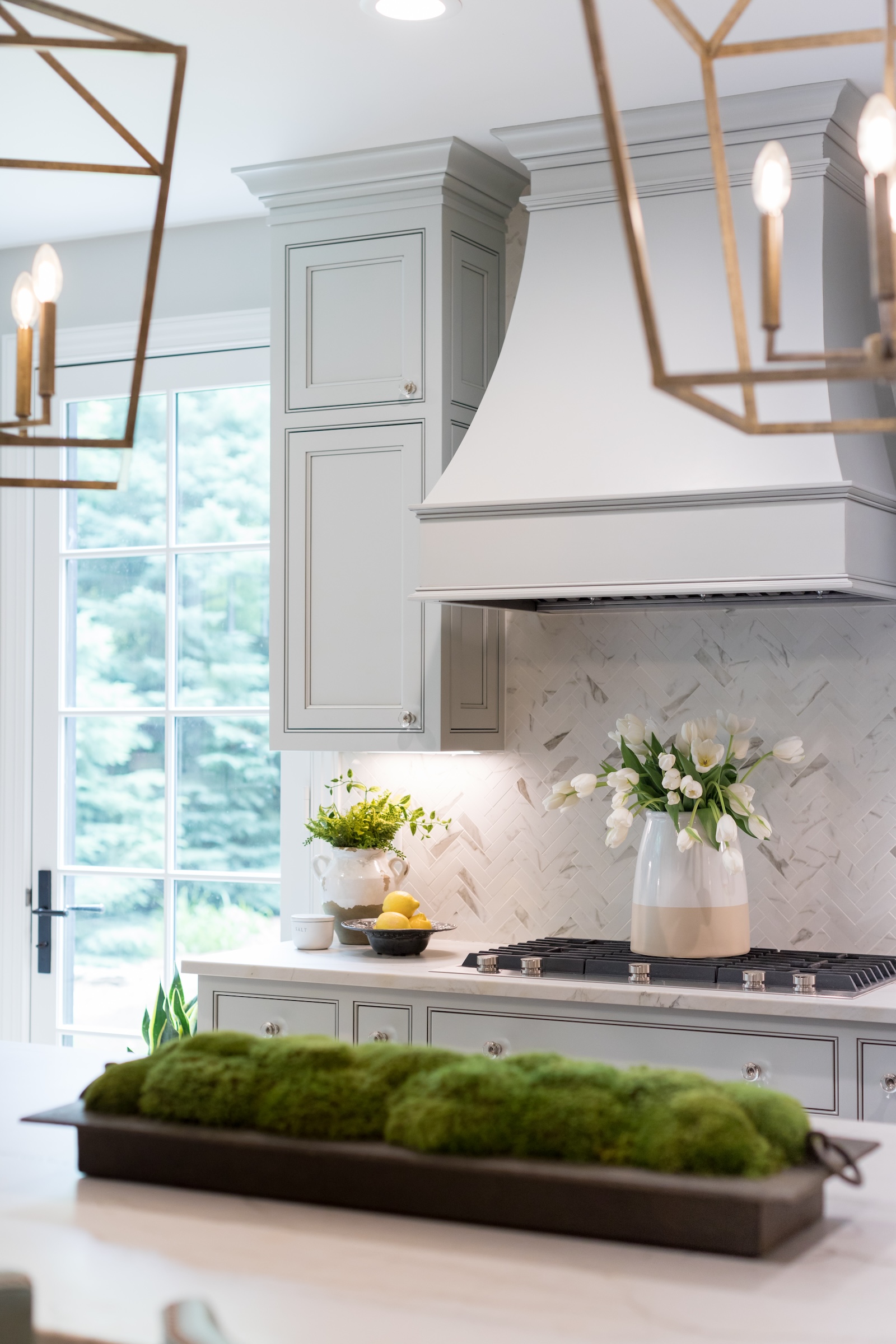
Among my go-to neutral paint colors are Cloud White (967) by Benjamin Moore, Silver Marlin by Benjamin Moore, Cotton (9581) by Sherwin Williams, and Loggia by Farrow & Ball.
Choose Your Color with Confidence
The art of choosing paint colors is a nuanced process that involves thoughtful consideration, careful testing, and a keen eye for timeless design. By embracing these recommendations and steering clear of common mistakes, you’ll unlock the full potential of your space, creating an environment that seamlessly blends beauty and functionality. Armed with these tips, you’re ready to take on the color swatches at your local Home Depot. Trust me- you’ve got this!
If you find that you need some expert help with paint colors, or designing a space in your home, fill out our contact form to get in touch! We’d love to set up a consultation to help you create the perfect space.


Renae Keller is an award-winning, ASID certified interior designer in Minneapolis-St. Paul, specializing in new construction and large remodels. Trusted by homebuilders, architects and homebuyers alike, Renae is known for creating an overall design vision that blends functionality and aesthetics, while keeping the details intertwined, and her customer's style in clear focus.
