5 Ways to mix prints like a Pro
Have you ever wondered how interior designers take a room from typical to curated looking? A lot of it has to do with creating contrast in the home. Here are a few tips for pattern mixing. A skill that requires time to perfect.
- Choose a print to lead with and one to use secondary
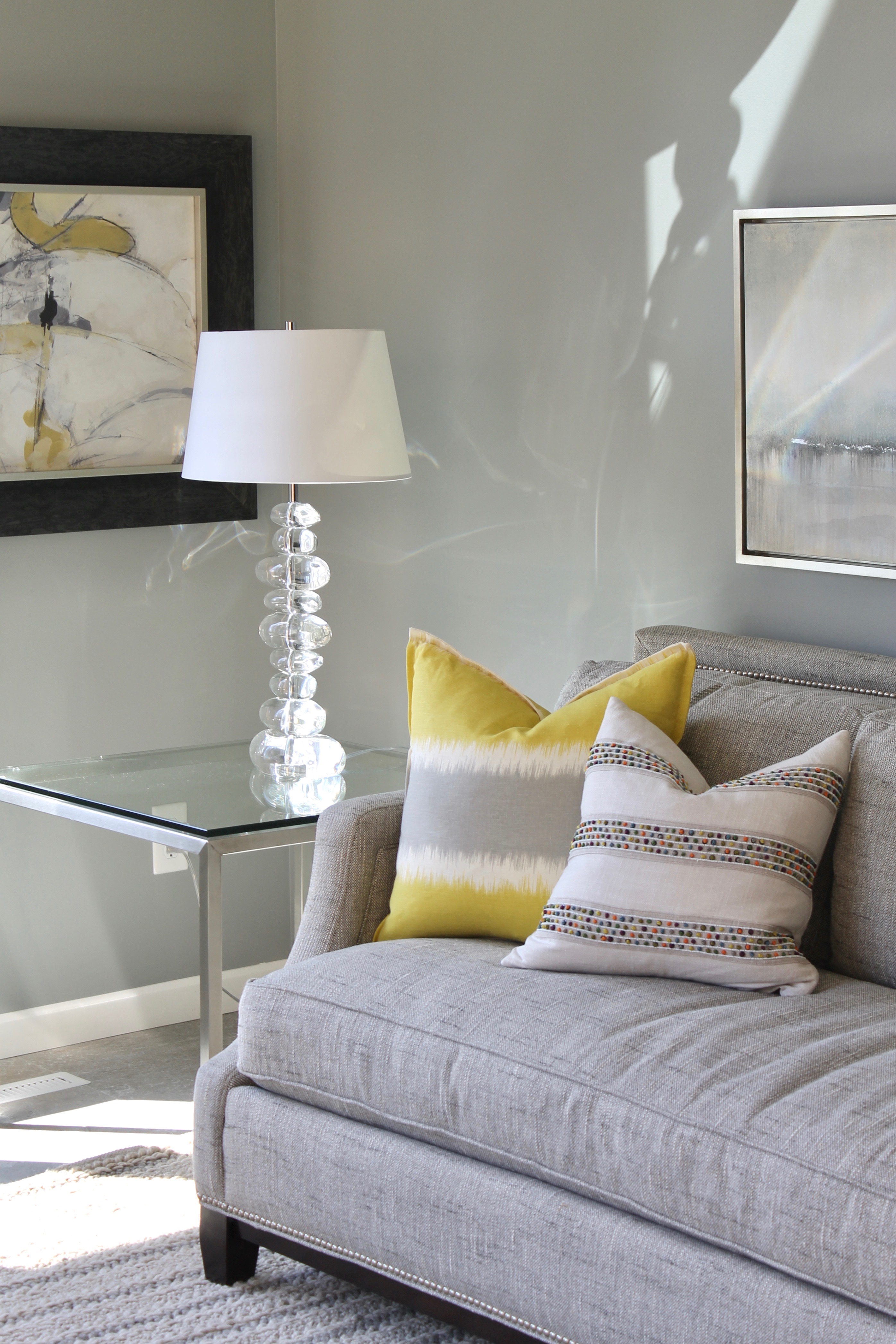
The gray-yellow is carried over from pillow to pillow and rests in other furnishings in the room. Having just the right amount of the dominant color is essential in a room. All of this hinges on other pieces in the room, such as placement, purpose, flow, accessories, texture, lighting, time of use, etc.
- Different scales of prints create interesting contrast
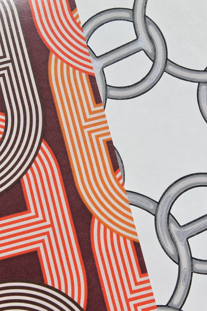
Wallpaper by Hérmes
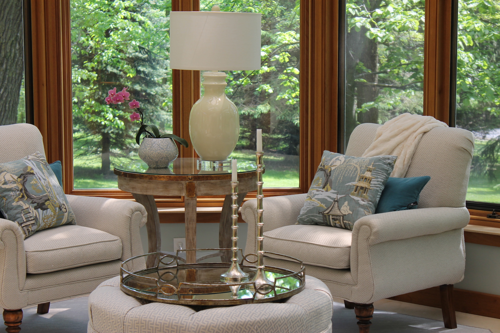
- Keep textiles in a color family
The blue family has endless possibilities!
- Pair prints with neutrals
Main neutral textiles with accent patterns create depth.
- Pick two different patterns that share a single color

Carrying color from room to room with a shared color creates cohesion.
For help designing your house click ‘Contact Us’ in our menu options.
-Renae

Renae Keller is an award-winning, ASID certified interior designer in Minneapolis-St. Paul, specializing in new construction and large remodels. Trusted by homebuilders, architects and homebuyers alike, Renae is known for creating an overall design vision that blends functionality and aesthetics, while keeping the details intertwined, and her customer's style in clear focus.
