When selecting art for your home or office there a few considerations to keep in mind. Color, content, and texture are some of them but what about if your not even sure about what colors belong in the the space. Framing is necessary and can often intimidate a buyer (black frame-white mat vs. gold frame- off white mat?!). This article is meant to help the new collector select art that “speaks to them” and also guide you to find a style that will help you begin your collection. Starting small can help you grasp what direction you will root your future collection in.
Color, Content, and Texture
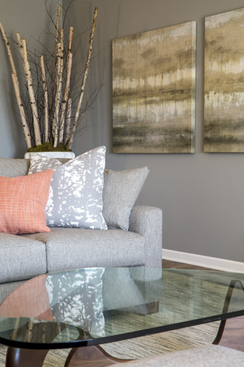
Color is intense, color is subtle. Color can make a room have a certain energy about it and it can also be what winds you down at the end of a day. Choosing art work that falls within the scheme or surrounding colors is a great first step. Working with an Interior Designer from the very beginning creates a premeditated and curated look; but if you are on your own and the wall color is staying as-is keep the wall color in mind. White walls are almost gallery like and scream for a great piece of art to be hung. Green walls would be a great host for a scenic landscape. Use your intuition and let it guide you. Below the Birch trees in a large indoor planter mimic the lines of the side-by-side paintings. The vertical and horizontal lines echo one another and leave a lasting emotional impression to people sitting in this family room.
Renae Keller Interior Design
Content is the center of art. A seascape evokes calmness and peace, perfect in a bathroom with your largest soaking tub or above your desk to gaze at to find refuse when the emails are pouring in. A gestural abstract painting creates a buzzing energy that sings with contemporary furniture.

Renae Keller Interior Design
Texture is the magic third ingredient to selecting the right art piece. Texture in terms of fabric is easy to describe but texture on a painting is visual and not a hand feel. Its easy to say linen is soft and wool is course but when talking about visual art it is slightly different. Oil paint can look wet just by adding linseed oil and appear water-like and oil pastels outlining a peony can look powdery and soft to the touch. Learning what mediums create what textures over time and what you have a preference for can be the fun part of starting a collection.
Notice how this Monet is soft on the eyes and the Jackson Pollock below is hard. Notice how paint is applied to the canvas and how it makes a difference.
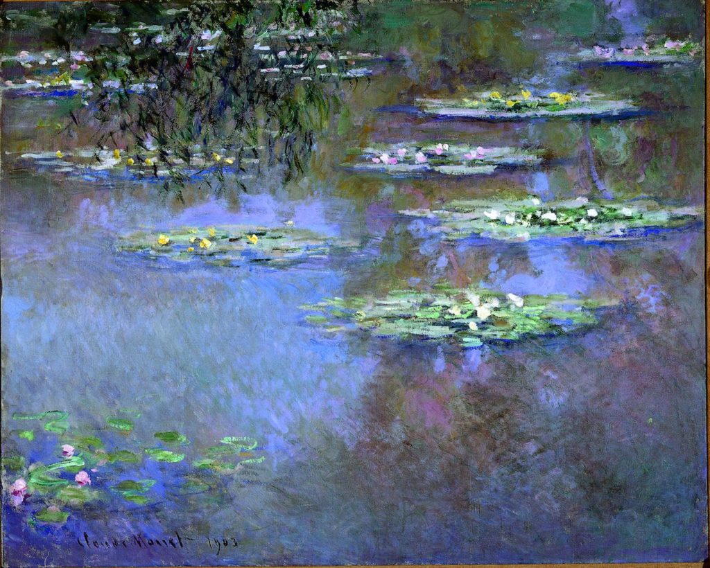
Waterlilies, 1903. Claude Monet (French, 1840–1926).

Number 1A, 1948. Jackson Pollock (American, 1912-1956)
Choosing a Framing
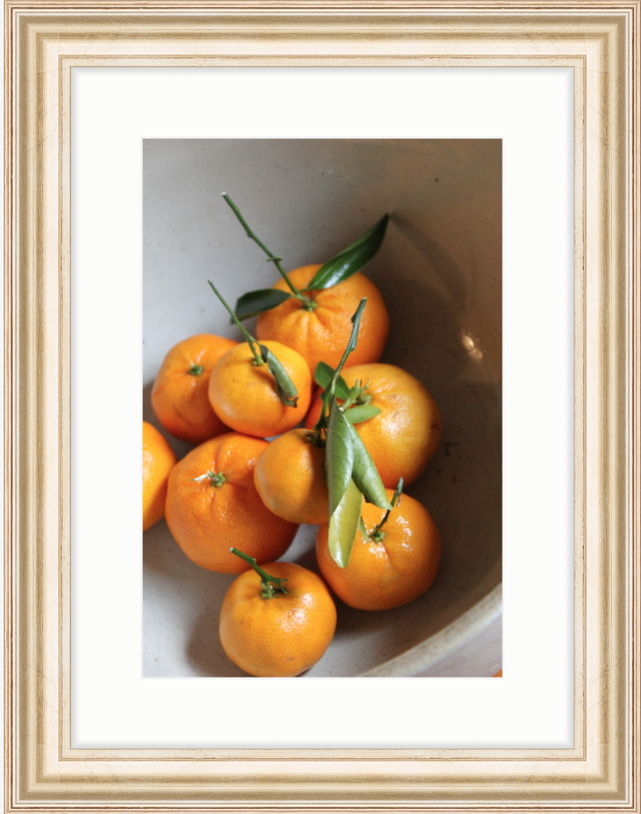
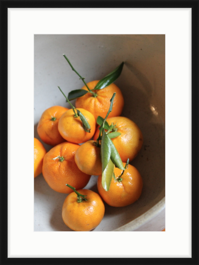
Framing can translate an overall look you are trying to achieve. Its kind of like a cherry on top of the room. Gold gilded frames ooze glamour and can make a room feel lux just by putting a simple Child’s drawing in one. A simple black frame can fit into many different types of rooms and also allows the art to speak for itself. Below I have two examples of the same piece of artwork in two different frames. Compare the two. Do they make you feel different? Does one seem more contemporary than the other? Choose for yourself what is best for your room and the statement you would like to make. In my opinion a simple off-white mat is a choice that you won’t regret with any style frame.
Hanging the Art
This may be what has kept you from displaying art in your house. Eye level is a safe place to hang your art. You want to look at your art when you walk by right?! Side by side is great for pieces that were painted with one another in mind (Scroll up to see this example). I have a personal favorite that I have named ‘Quad Framing’. Now you may be wondering what does that mean, well its it a group of four pieces; Hang two across, two down. It works really well when you have four pieces from the same artist or print collection.

Renae Keller Interior Design
Renae Keller Interior Design
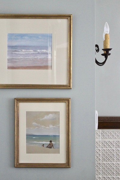
The last picture is of two framed seascapes with a right orientation on the wall. This allows for a light switch to have its place on the wall; Get creative. Remember hanging a picture is not permanent. Its a great way to experiment with a look in your home. Low risk, high reward.
If you have any questions feel free to contact me and I would be happy to help. My website explains the process of working with me and don’t forget it is supposed to be fun!
Happy Hanging, Renae
1 Comment
Leave a Comment

Renae Keller is an award-winning, ASID certified interior designer in Minneapolis-St. Paul, specializing in new construction and large remodels. Trusted by homebuilders, architects and homebuyers alike, Renae is known for creating an overall design vision that blends functionality and aesthetics, while keeping the details intertwined, and her customer's style in clear focus.

I like how you mentioned you could hang two pieces of art across and two down if you have art from the same collection. My wife recently has been looking for specific art pieces by the same artist to hang in our brand new house so it’s not as bare. I’ll be sure to show this to her so she can find a good art piece to hang.